Content Management Systems
Publishing Task 1
This week's assignment tasked us with researching and taking notes from industry experts on the subject of UX, UI or CMS in relation to web design.
Source One
For my first source, I decided to visit a well-known design academy that offer online workshops via YouTube - Flux Academy. With over 450,000 subscribers, Flux Academy have amassed over 27 million channel views and have become a popular online resource for students and web designers around the world.
The workshop that I decided to follow from them is UX/UI Best Practices for Web Design - episode 12 of their free web design course series. I found the episode to be extremely informative. This particular workshop was presented by Ran Segall, a full-stack designer.
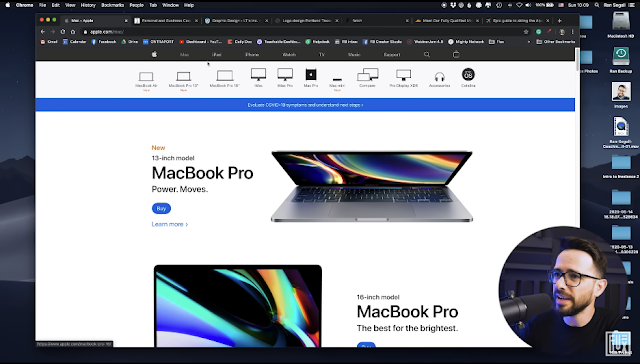
The way the video was presented made it very engaging, and thus easier to take notes and gain new insight into the world of UX and UI for web design. Starting the video by explaining visually the difference between good and bad UX design - comparing Apple's website to that of a British car leasing business.
Through Ran's explanation, it was clear to see from first glance that we knew exactly where we were when navigating Apple's website. Their simple but clever use of a navigational hierarchy as well as minimal styling ensured that the end user could easily tell which part of the website they were visiting by simply looking at this navigation menu. On the flipside, when looking at the second website, the navigation bar or content layout barely changed when visiting other pages within the site. This makes it extremely confusing to the end user when trying to browse the website as there is no indication as to what page you're visiting.
"The best tip I can give you is to not make people think. Don't be original, be obvious. Don't be witty, be crystal clear."
Copywriting
Ran went on to discuss the importance of copywriting when design a website. As mentioned above, knowing where you are on a website is important, and by putting some basic thought and effort into appropriately styling the buttons within your navigational menus, you can easily ensure this. It's important to know exactly what a button will do when you click on it. Again, Apple's website was used as an example of excellent copywriting, with the contrasting example being a website for a graphic design business in the US, where buttons were poorly titled and styled, making it confusing for the end user to browse. Including interactions such as changes in text or wrap colour when hovered over is one simple way of copywriting effectively. One of the last tips Ran gave was ensuring that if there is a button that is of a certain colour, it's important that there is no non-buttons that are of the same colour, as this can cause issues for visitors.
"You want to design your website in a way that is consistent but not confusing"
Images
The last thing that Ran discussed within this video was the use of images, and the importance of contrast when using a text and image combination. Using a mountaineering website as an example of poor image practice, he spoke about how important thought is when displaying images, ensuring that there is a good level of contrast that both the image is still visible, but that the overlay text is also legible.
Source Two
The second source I viewed was a keynote delivered by Mustafa Kurtuldu, a Senior UX Designer for Google at the time of the keynote, which was delivered at the Awwwards Conference in Amsterdam. He is now a design lead at Twitter.
What was most interesting about Mustafa's keynote, was that it was focused mostly on designing for speed, and ensuring smooth browsing for the end user through perceived speed. He discussed technicals tricks that can improve the speed of the site as well as some great optimization tips that can often be overlooked.
"In UX you have a choice - you either solve complexity for the user, or you pass on complexity to the user."
An interesting point that Mustafa made is that oftentimes, designer can reframe a problem as opposed to solving it, making the experience for the end user as frustrating as before, and that is one of the biggest challengers designers face.
As Ran said, be obvious, make sure that the browsing experience is as simple and to the point as can be.


Comments
Post a Comment